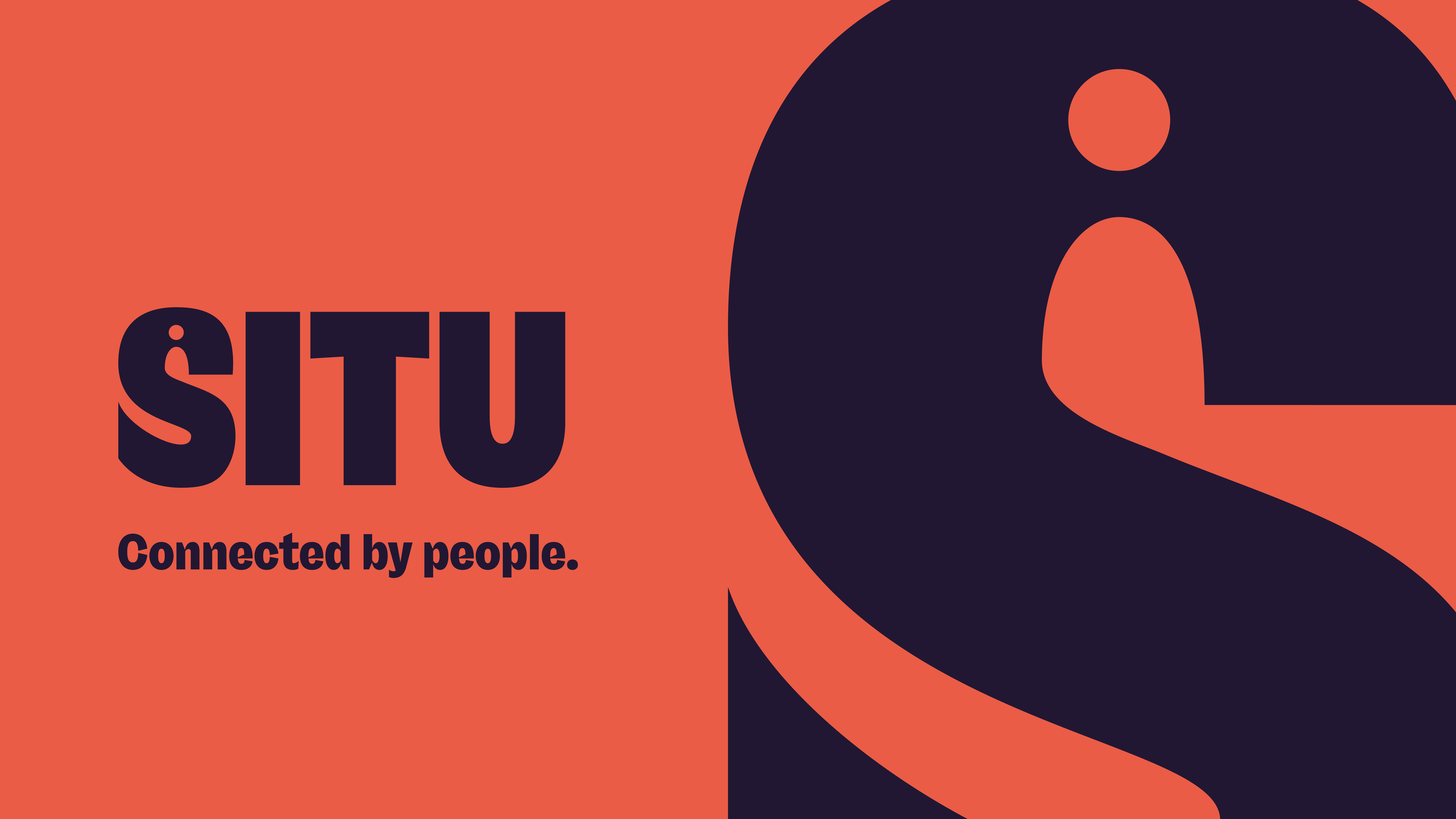
Brand Situ
Agency Mr B & Friends
Deliverables
Brand strategy
Brand positioning
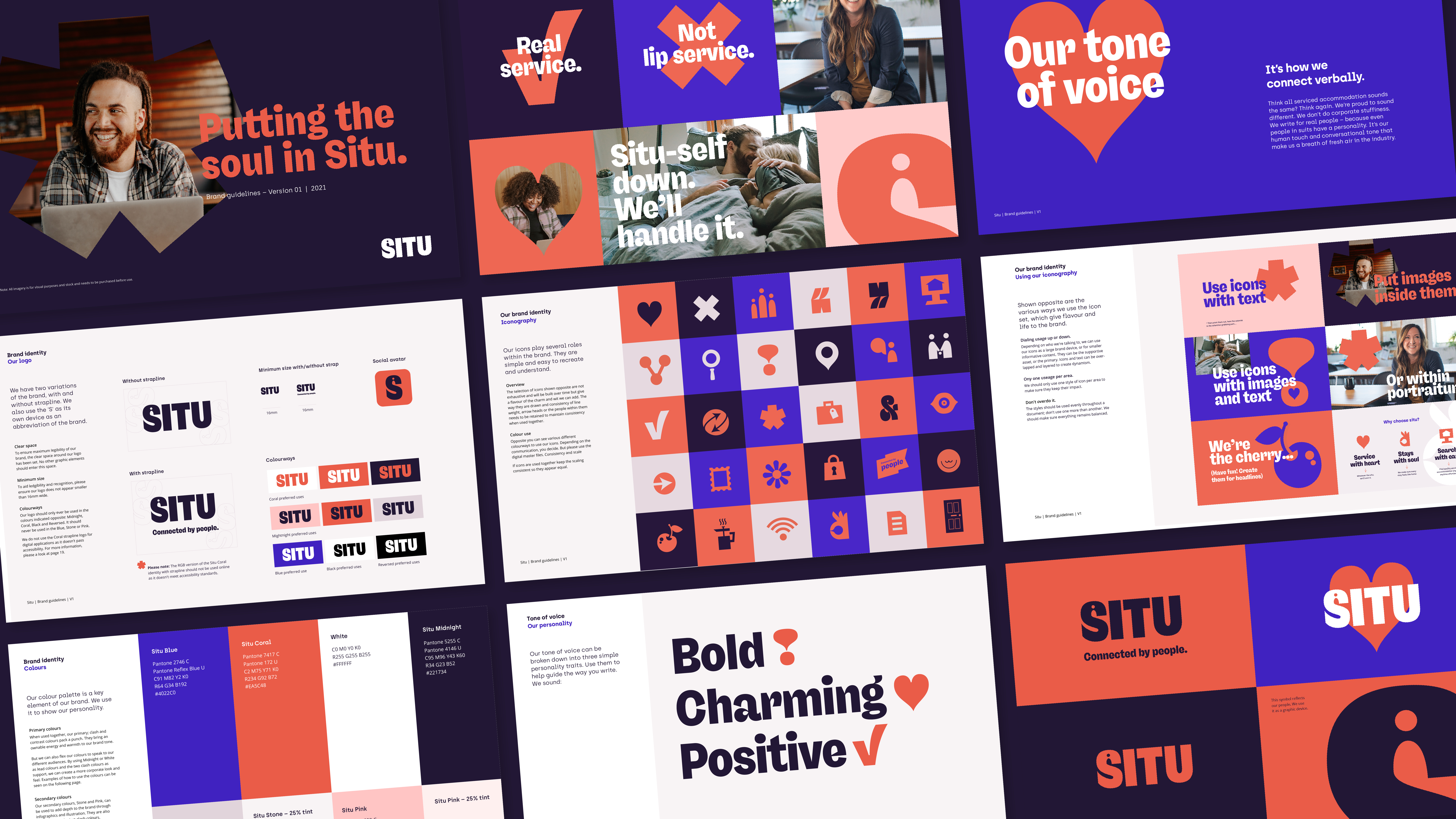
Brand identity
Visual language
UX/UI design
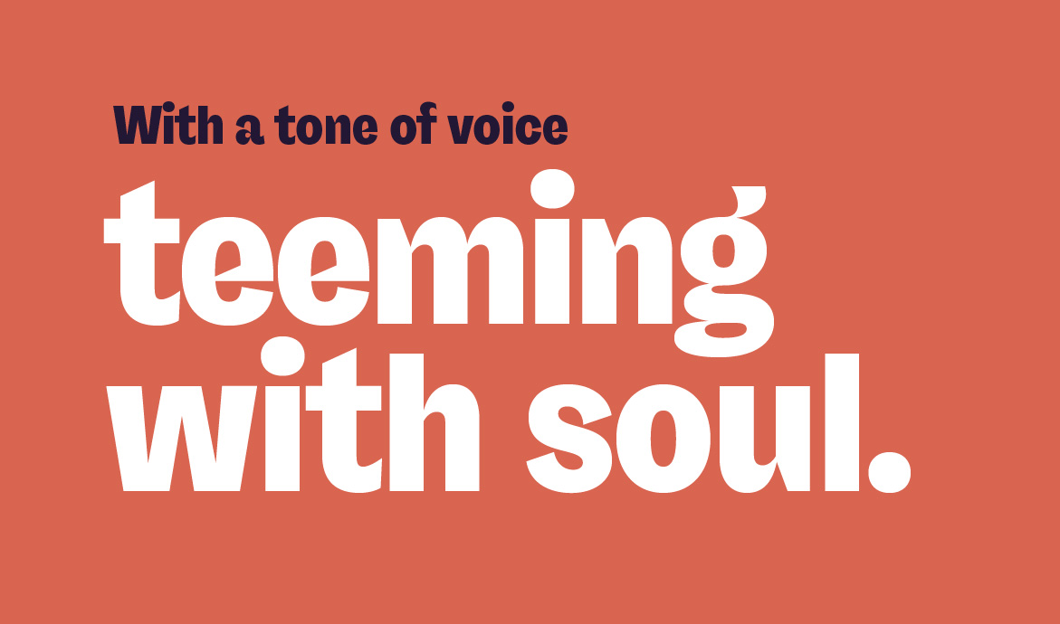
Tone of voice
Iconography
Photo library
Awards
Most Creative Marketing
CHPA 2023, NY
Best Marketing or Branding
Campaign Serviced Apartment
Awards 2022.
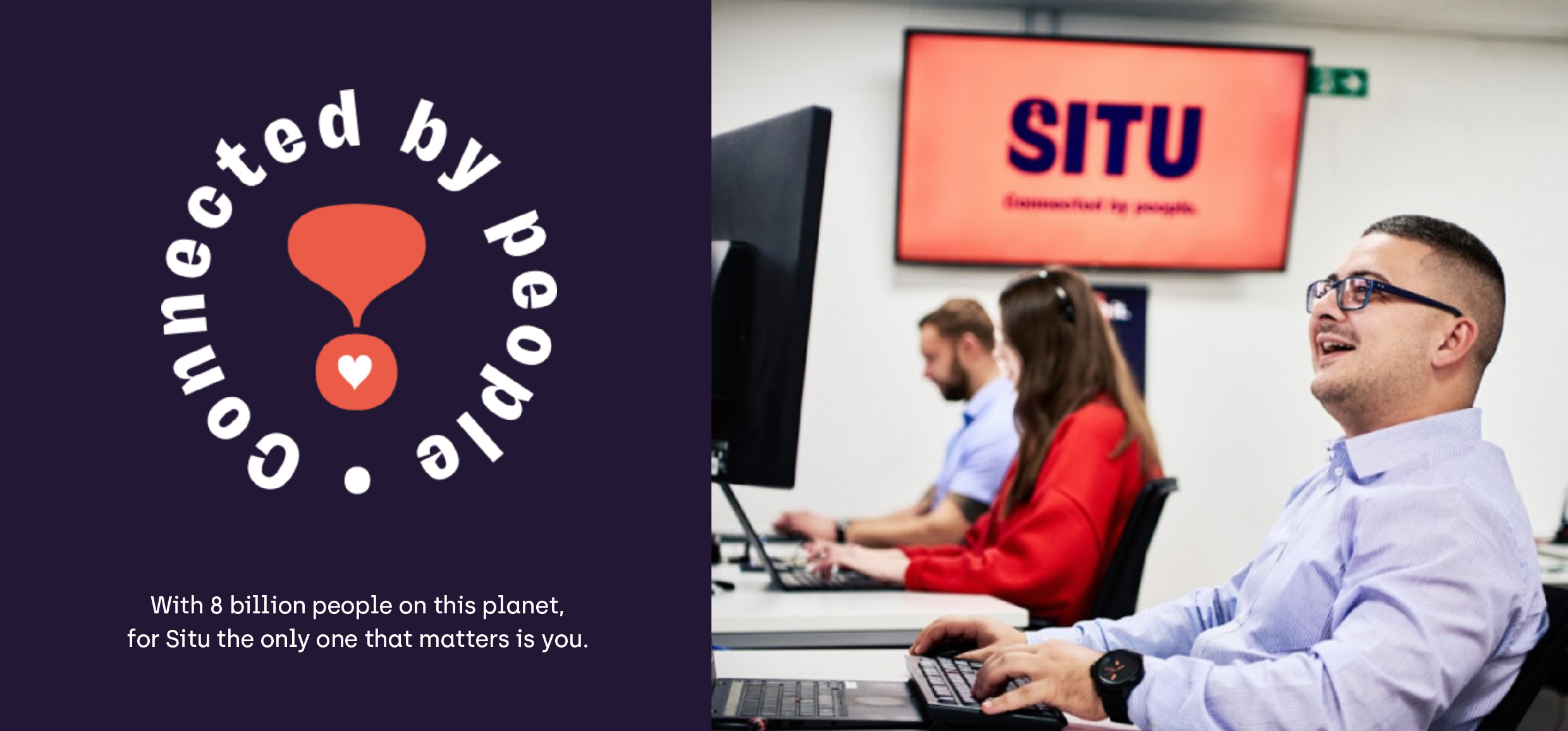
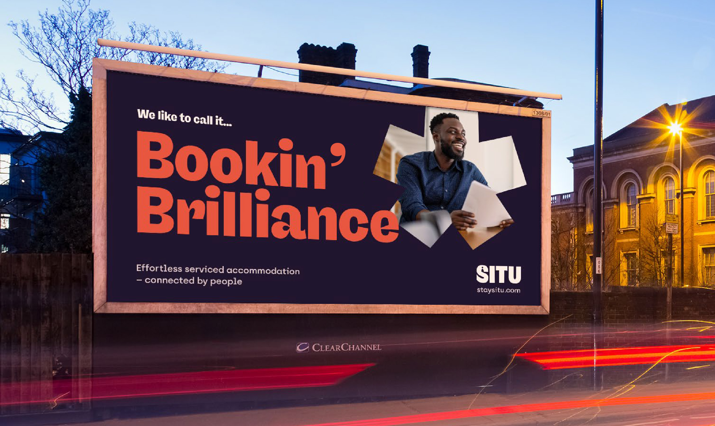
Situ combines clever tech with first-class customer experience for an effortless delivery of serviced accommodation. Think of them like the business version of Airbnb.
From Brussels to New York their to point of difference is clear – they emphasise the people they have, the relationships they build and the quality of their bespoke technology.
Every Situ listing is subject to stringent quality checks to make sure it’s perfect; criteria that ensures Situ continually achieve excellent service ratings in a world of faceless booking agents and platforms, Situ’s approach has always been people-first. They understand that working abroad you need a homebase which works for you and your family.t.
Situ. Connected by people.
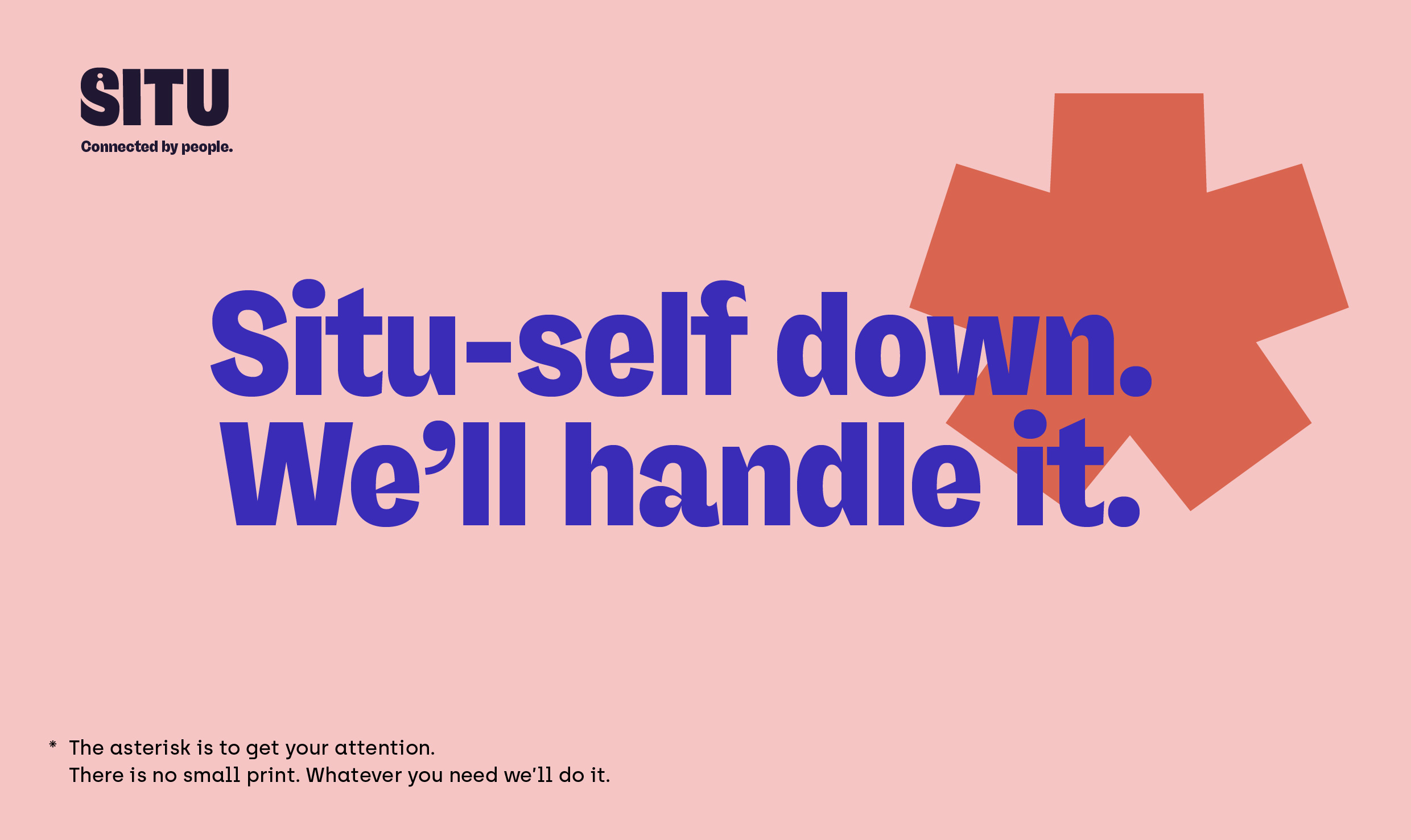
Situ-self down. We've got this.
The team spent time getting to know Founder and MD Phil Stapleton, Head of Comms Jo Redman and Senior Marketing Manager Tamara Edgar. The warmth of the company and vision for the brand became clear from the first meeting, they really went further and cared for their clients, across the globe.
We shared three concepts, but one was unanimously agreed upon. With such a brilliant name, the identity was kept simple to focus on digital usage and people in the wordmark. Then the tone and visual language delivered the energy and attitude.

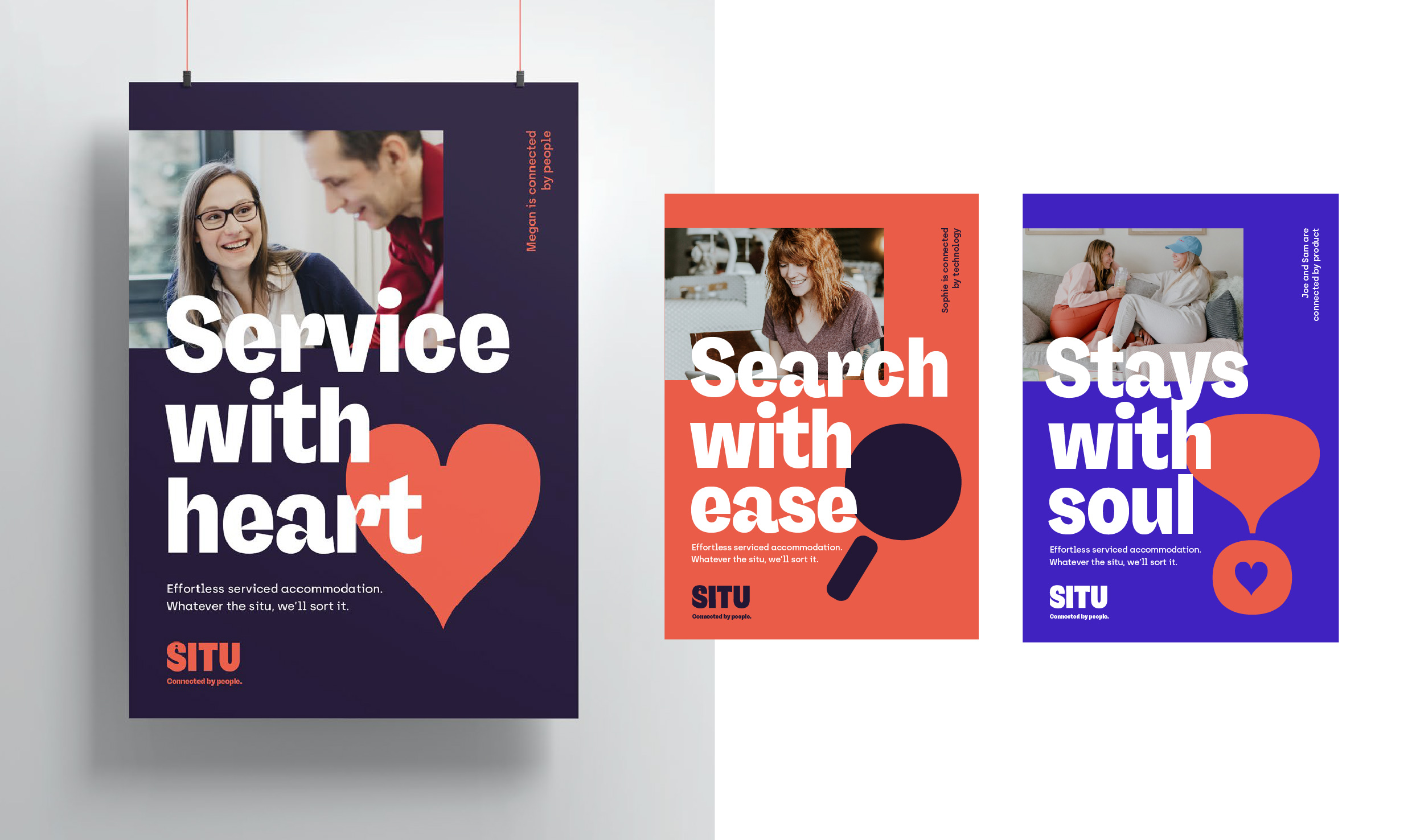
How we made it love at first book.
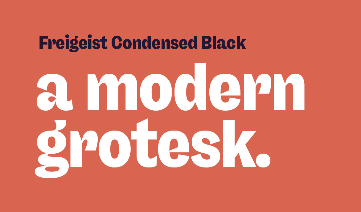
The typeface Freigeist Condensed was chosen for its quirk and character. Freigeist is German for 'free spirit' and has the untamed freedom of letterforms, which when teamed with the Situ tone of voice gives the internal team licence to explore.
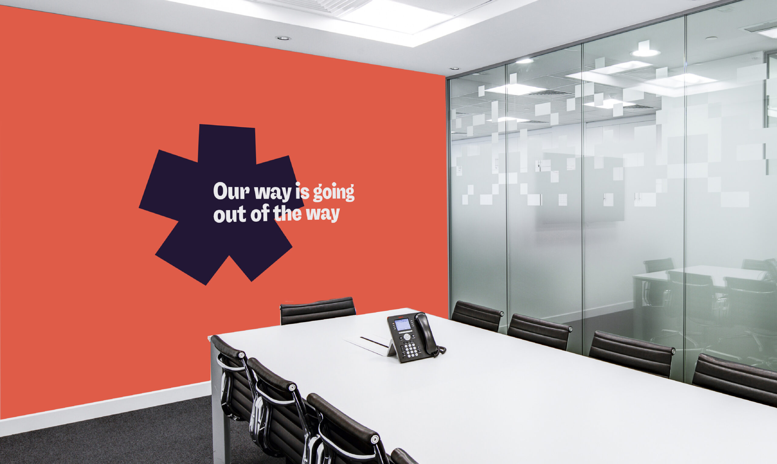
Phrases like 'bookin' brilliant' and 'situ-self down' have become short-hand for the brand idea and common terminology with the client team. This has helped Situ to stand-out and win marketing and industry awards in a homogenised category.
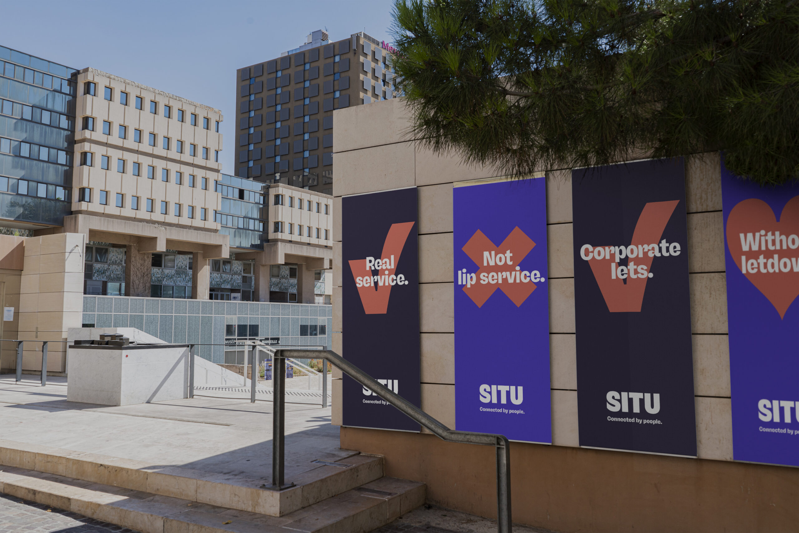
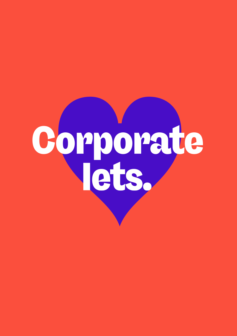
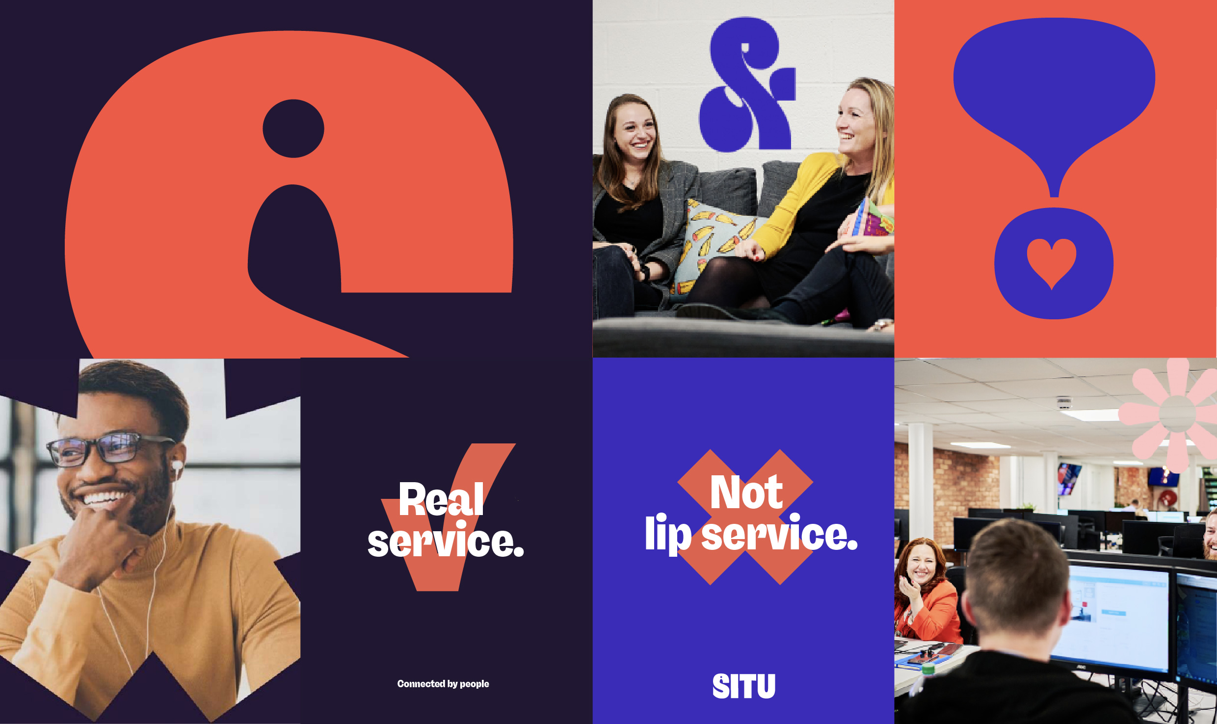
Real service. Not lip service.
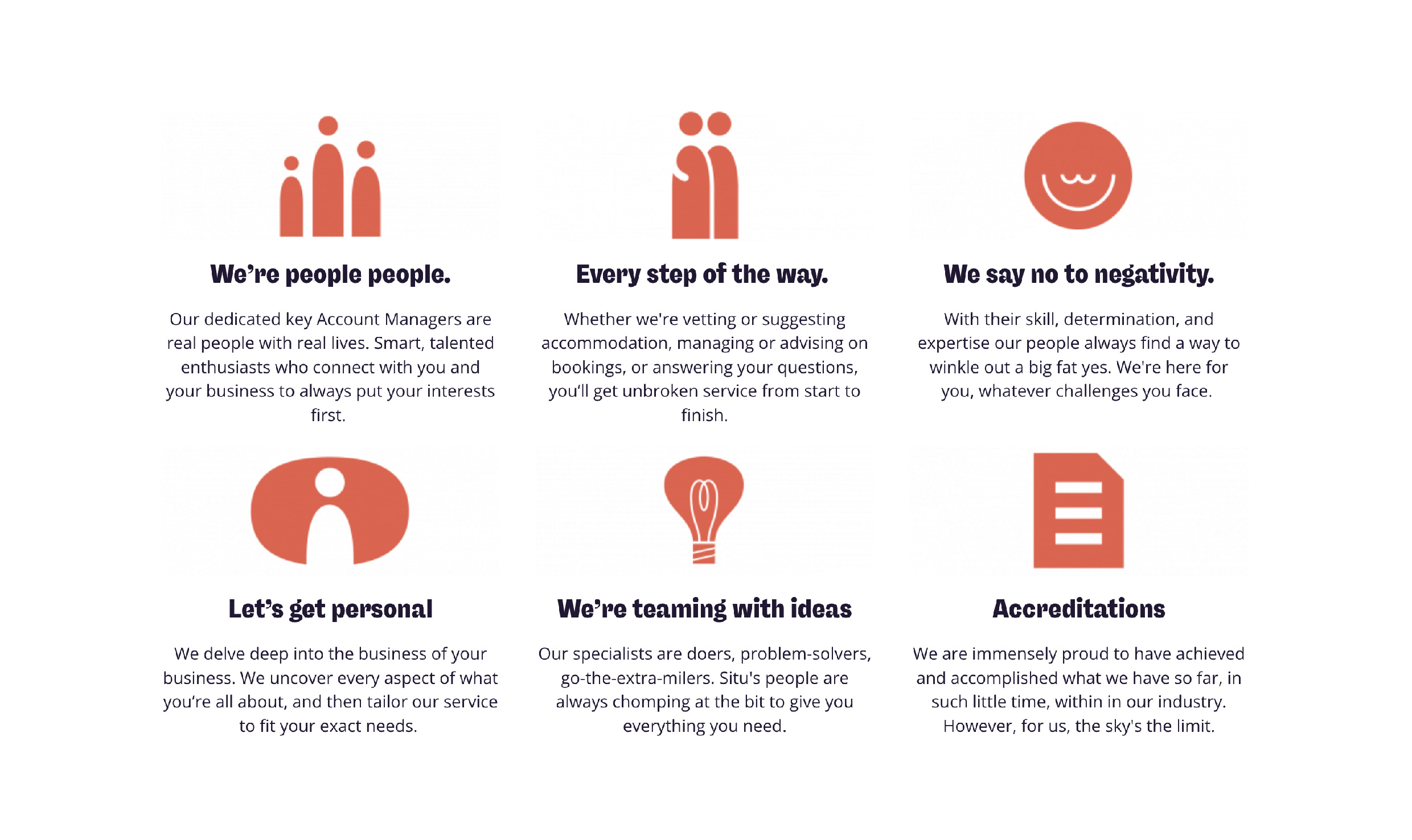
We now had our brand platform and creative jumping-off point. What we had to do then is provide a meaningful visual language and brand guidelines for the internal team to implement. Every touch-point had a lot of 'bookin' brilliance' to live up to. From merch to website we explored how the tone and soul of the brand could come to life in iconography, a layered visual style, photography and brand values through to CSR policies and employee handbooks.
Thanks to Phil, Tamara and Jo from the client team. And Mr B & Friends Simon Barbato, Liam Smith, Andy Kaye, Olivia Cox, Harriet Whitehorne, Sara Foley, Chris Tozer and Neil Lenihan.
Need new energy?
I work closely with leadership teams to get under the skin of their business and pinpoint brand ideas which show their best side.

Symbol Studio is the site of Steve Richardson – Creative Director and Designer. Strategy, Brand and Creativity. Based in Wellington Pōneke, Aotearoa, New Zealand.