Brand Heart of BS13
Agency Symbol Studio
Deliverables
Creative concepts
Campaign idea
Tone of voice
Art Direction
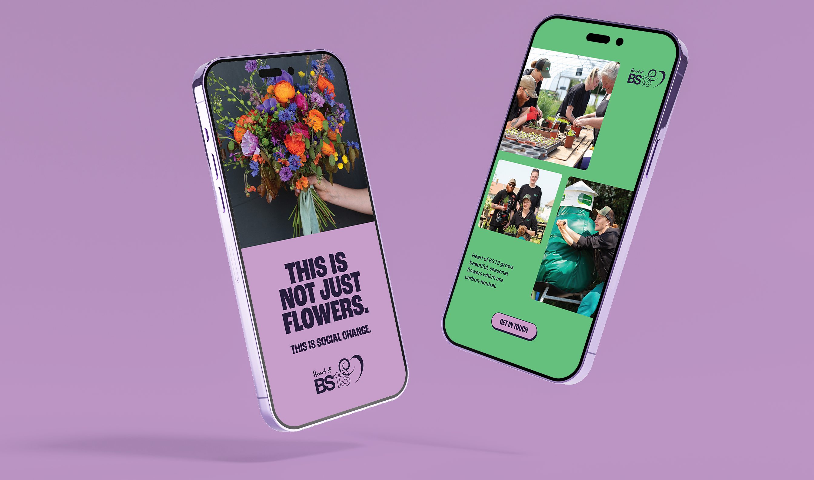
OOH and Social
Photography
Thanks to Fergus Coyle
www.ferguscoyle.com
Heart of BS13 is a charity based in Bristol UK. It's dedicated to health, wellbeing and social action for an underpriviledged area of the city.
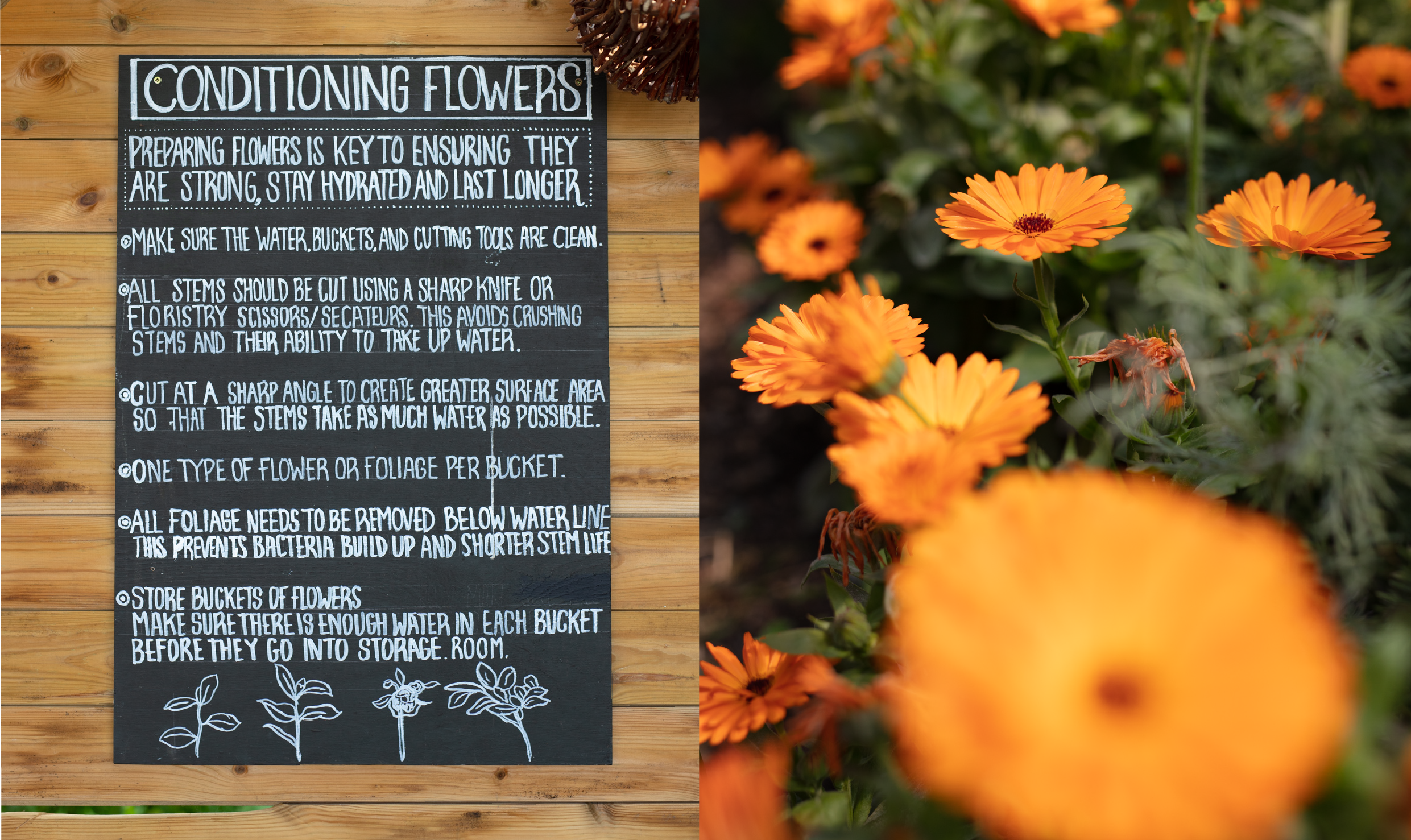
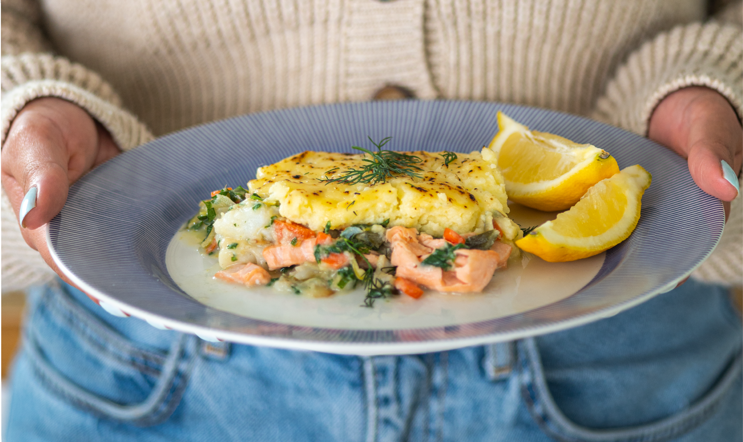
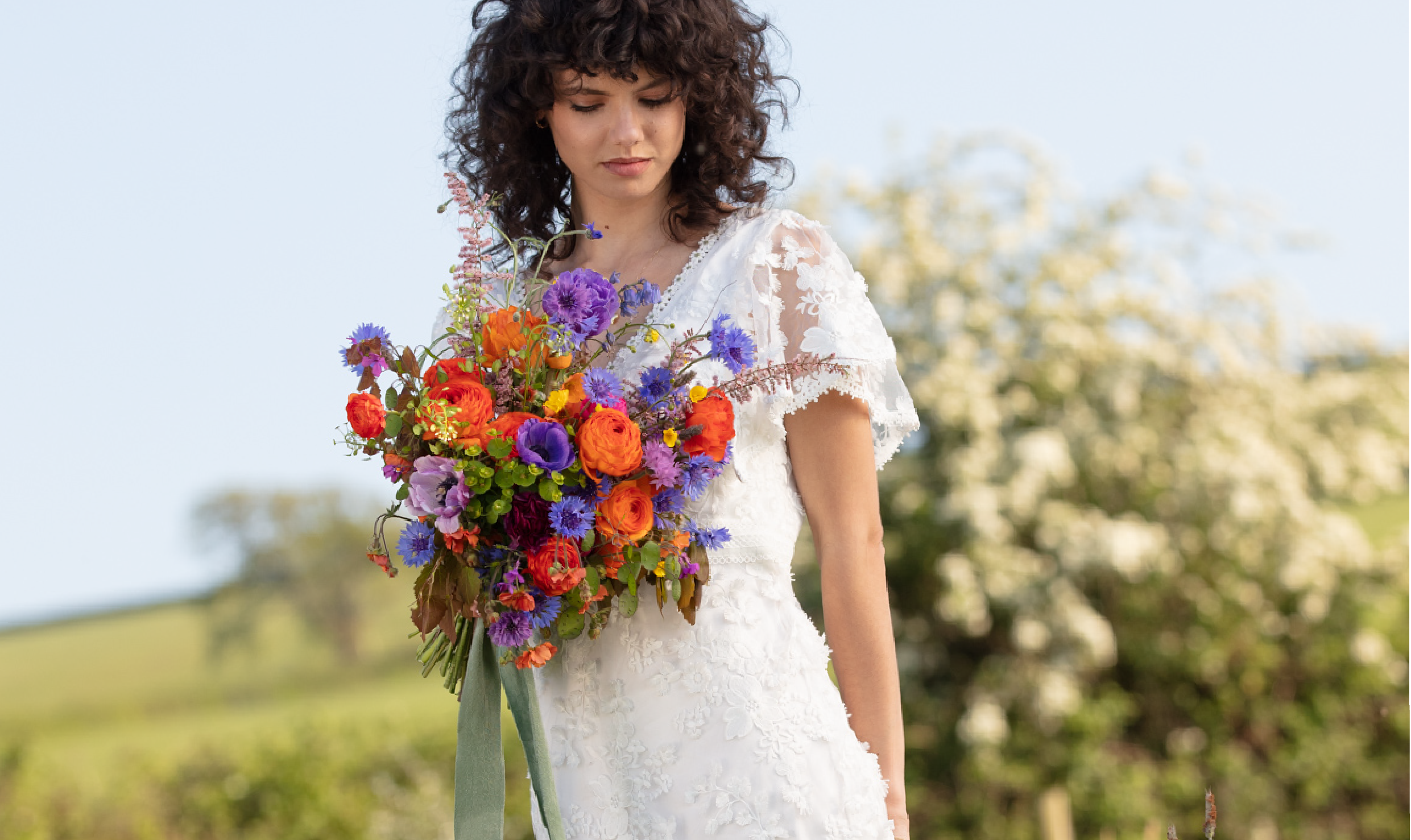
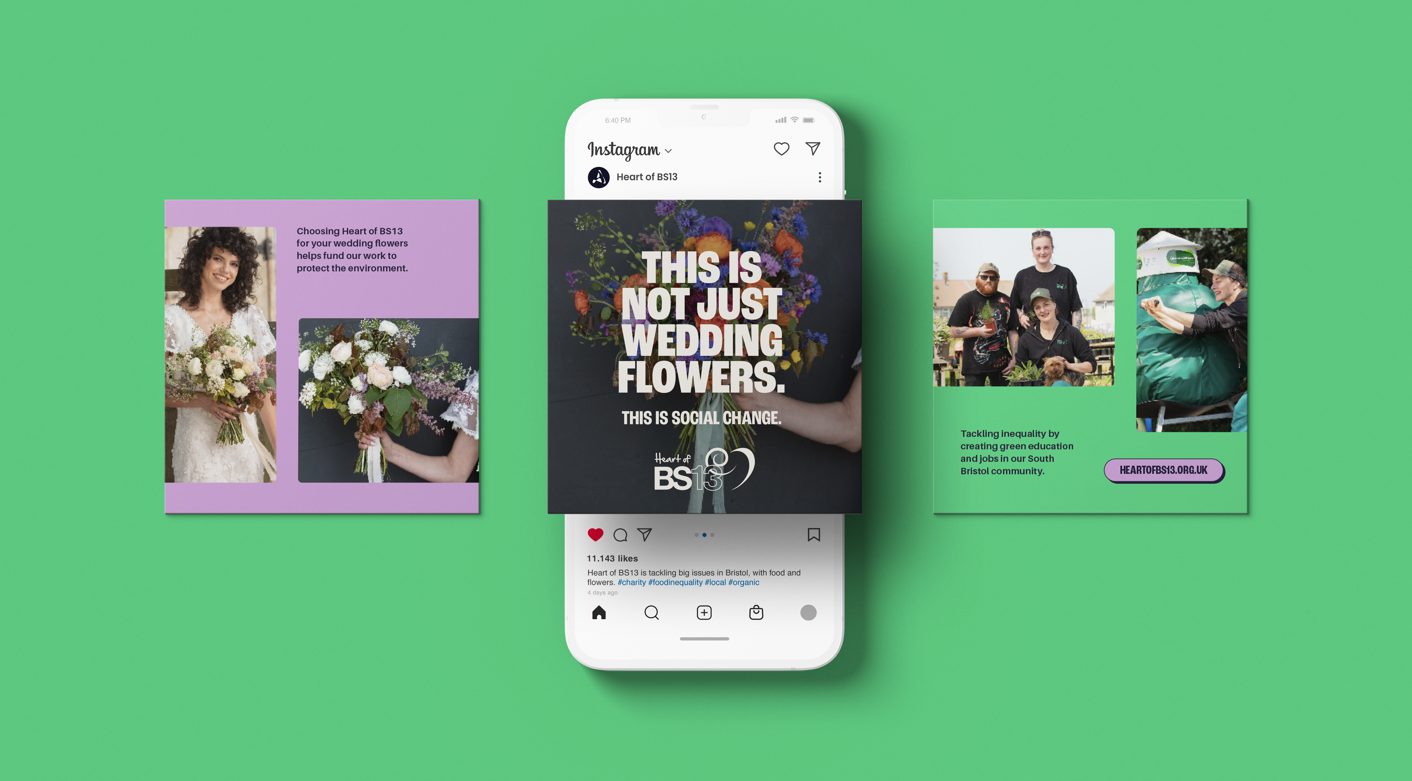
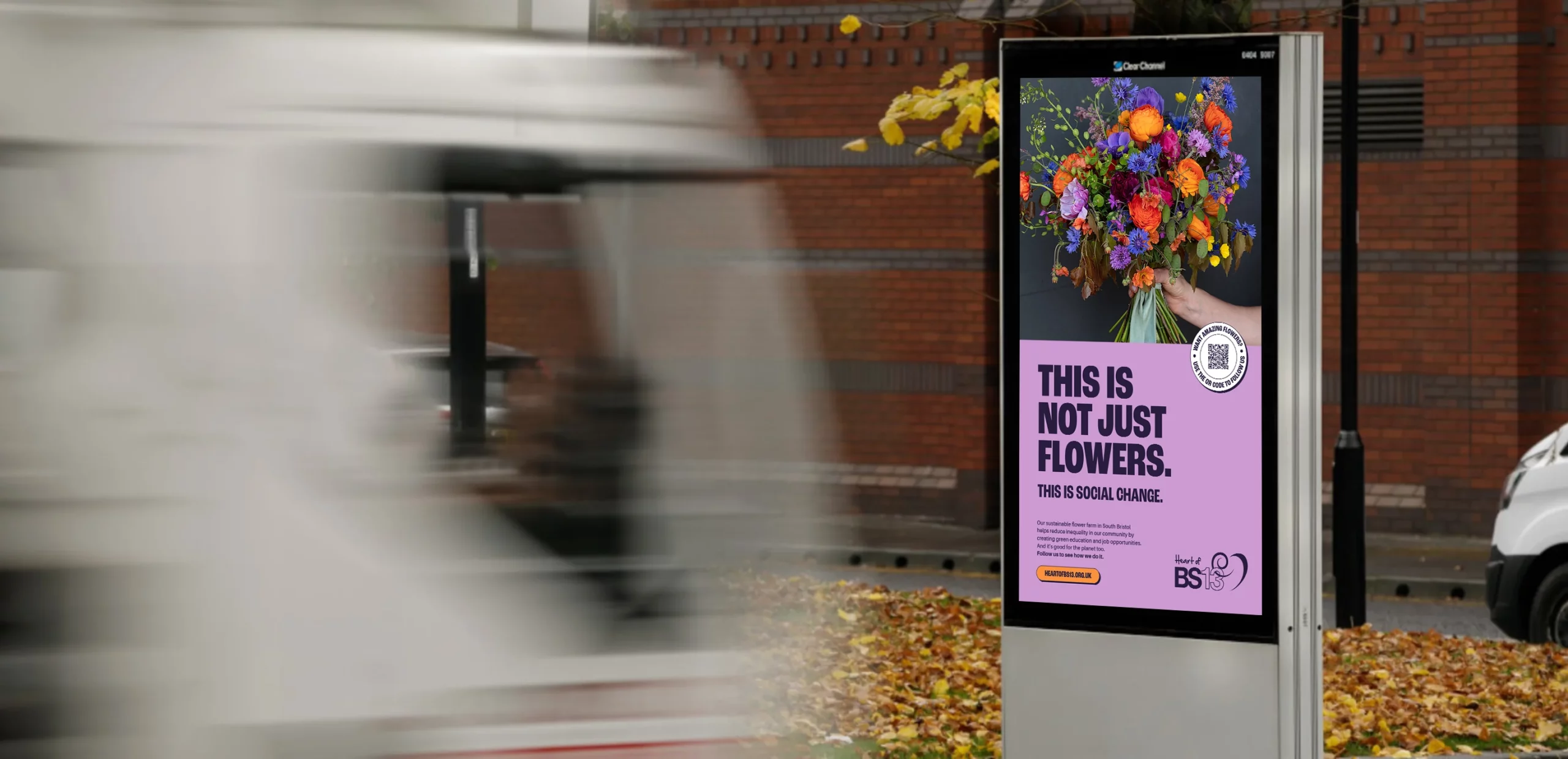
Through their Hartcliffe City Farm, they grow low-carbon chemical free flowers for wedding and events as well as addressing food poverty with a ready meal range and community kitchen. The meals are made on site and help to tackle access to quality food in the local area.
Symbol were tasked with creating an OOH and social campaign to sell the flowers as well as the meals, and raise awareness of Heart of BS13 and what they do. A tall order, but the sort of challenge that we relish.
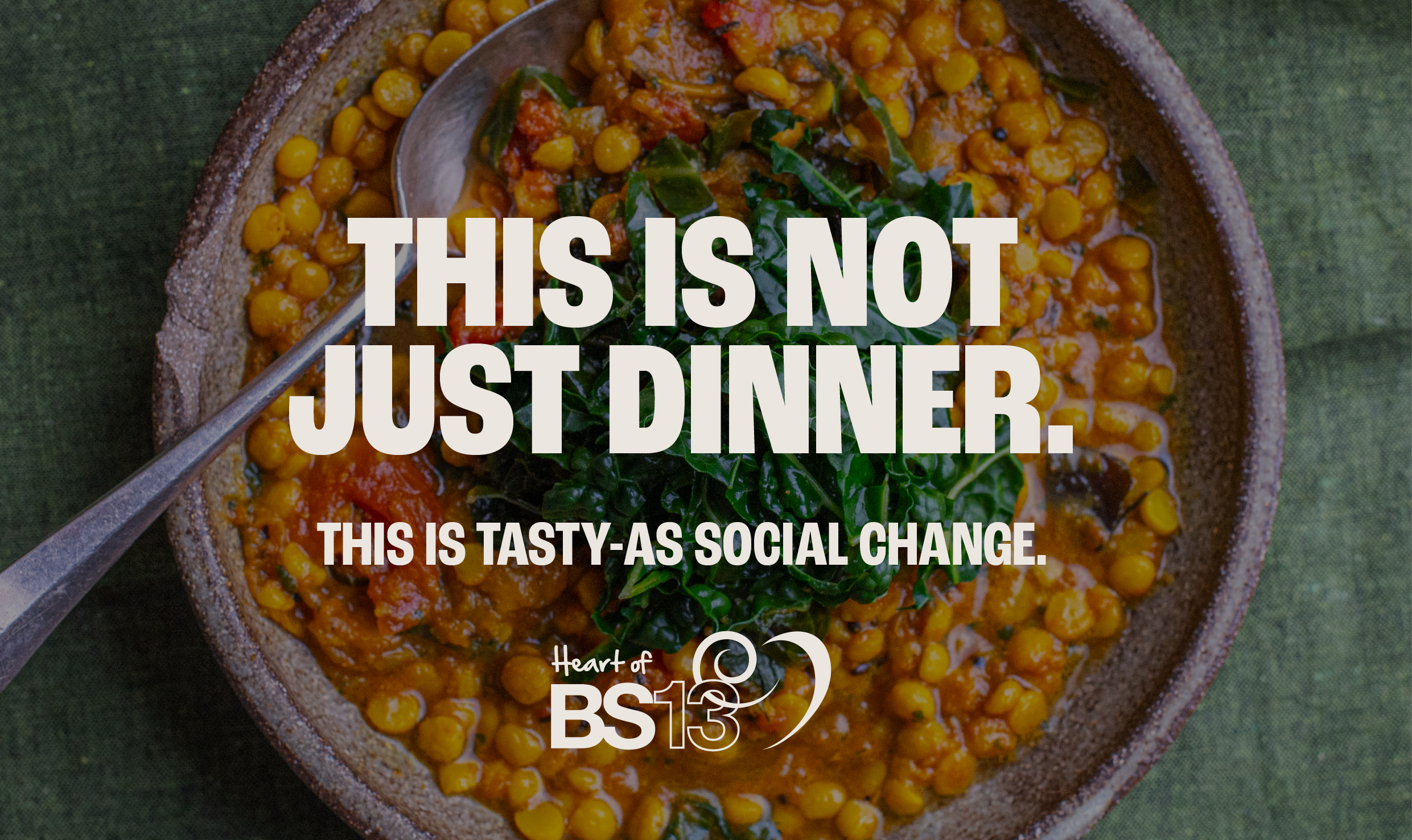
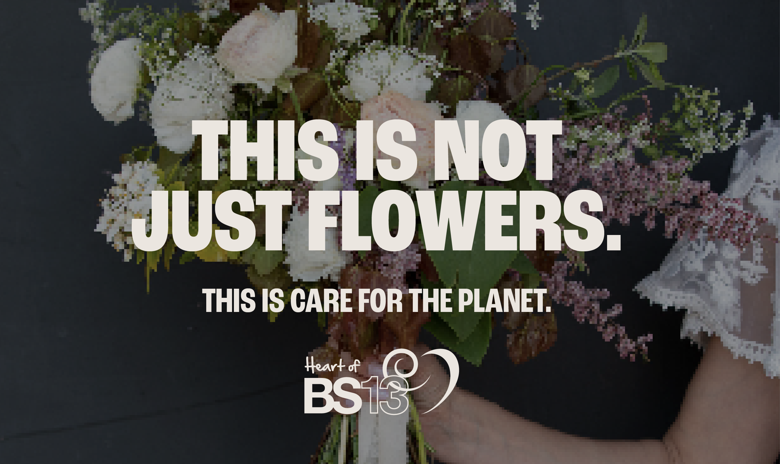
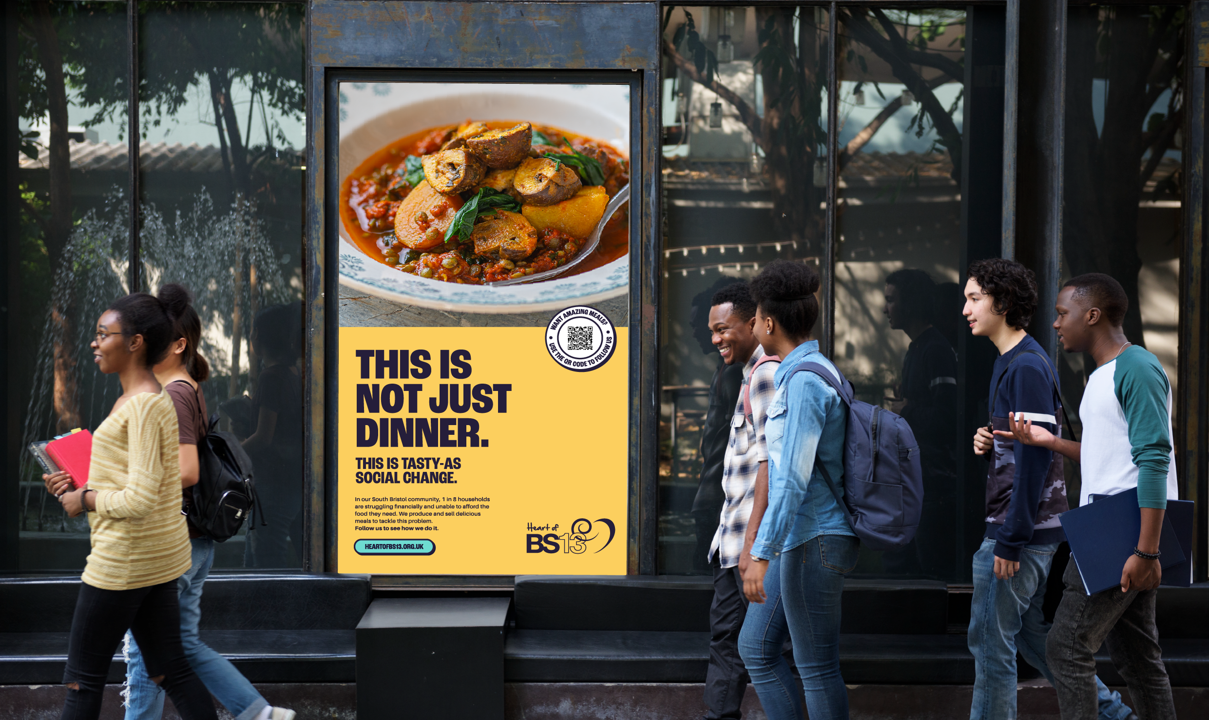
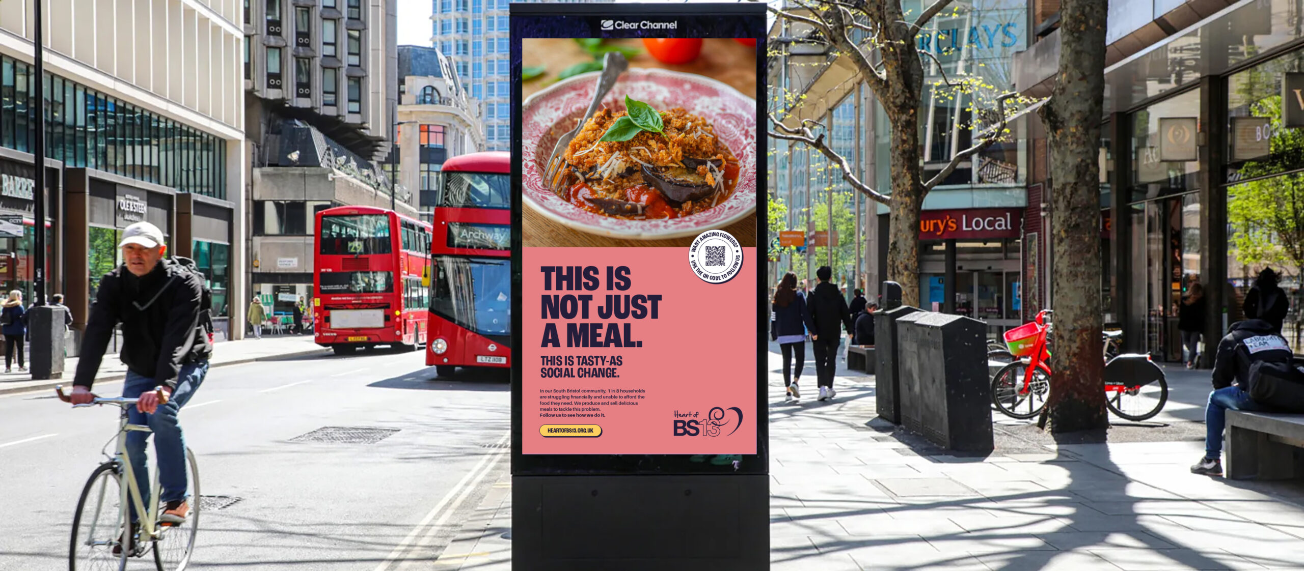
More than meals and flowers.
Having received the brief from Mr B & Friends, we worked closely with the Heart of BS13 team to create something that spoke to the wider challenges. It still had to appeal to locals who wanted a home-cooked meal for their family or some fresh locally grown flowers for an event. We came up with three initial concepts, but the one that resonated was a vibrant idea that Heart of BS13's offer is much, much more. Read all about what they do here.
Doing good and giving back.
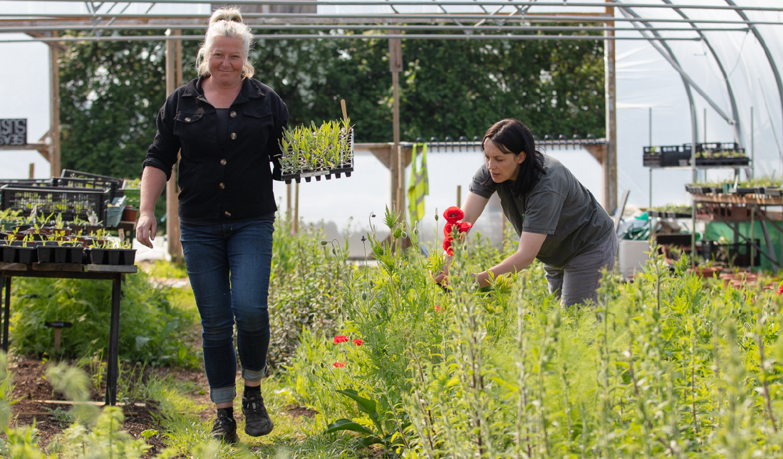
Unlike most flowers available in the shops, Heart of BS13's are not sprayed with pesticides, flown in from across the world or at all generic – they are chemical-free, low-carbon, seasonal with a sweet scent and incredibly beautiful.
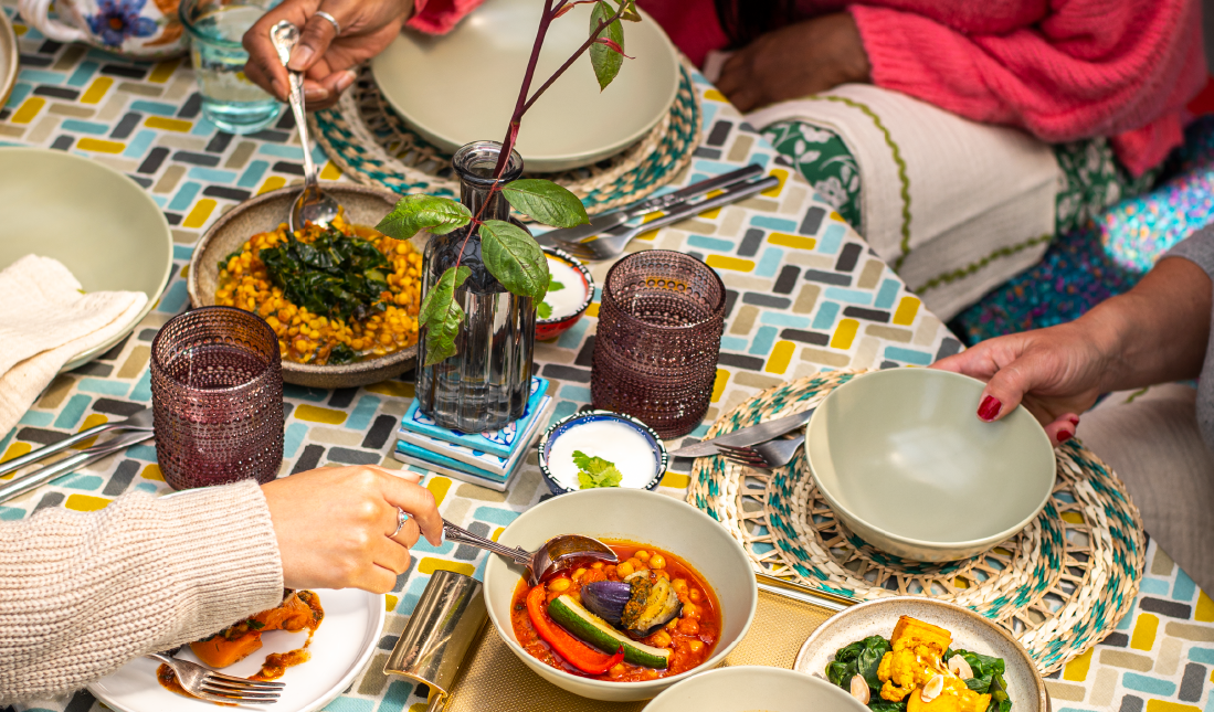
Research showed 1 in 8 households are struggling financially and unable to afford the food they need. Heart of BS13’s Kitchen was set up to address food insecurity – through their Community Freezer, Slow Cooker Club and Mobile Food Shop.
A vibrant change with colour and energy
We suggested to the client team directions we could push the existing brand to aid distinctiveness and stand-out. These were a new fresh colour palette, moving away from the standard greens, and adding a bold energised typeface to deliver the hard hitting messages. Roc Grotesk Condensed was chosen to give stand-out to each of the messages.
We were fortunate to be given some fantastic photography from Fergus Coyle, which we used to highlight the colour and freshness of the meals and flowers.
Charity in need of a boost?
I love putting my skills to the test for sustainable, ethical and charitable causes. Drop me a line I'd love to hear about yours.
Symbol Studio is the site of Steve Richardson – Creative Director and Designer. Strategy, Brand and Creativity. Based in Wellington Pōneke, Aotearoa, New Zealand.